Third Weekend Update
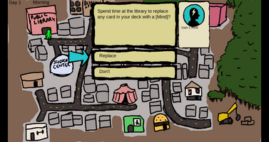
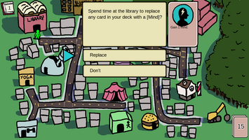
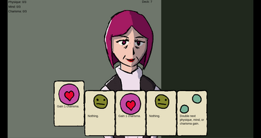
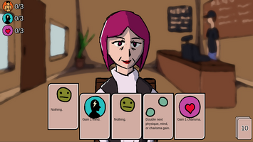
It's been a weekend of UI updates and art.
On the UI front, I made a much nicer HUD for showing the scores, current day, and cards remaining in the deck. No more plain text labels! I also added an animation for discarding cards. Plus there are sound effects for cursor actions, although I think I'll redo them.
On the art side of things, I redrew the world map and added a day-night cycle. The map is also layered so you can't walk on top of buildings. New, cleaner designs for card frames, dialogue windows, and the cell phone all look pretty slick.
The biggest piece of new art is a background image for the dates. Your first couple dates will be in a coffee shop. Not sure where to go beyond there.
Screenshots showing before and after are attached.
Get Queen of Hearts
Queen of Hearts
A NSFW deck-building dating game
| Status | In development |
| Author | Uskprod |
| Genre | Card Game |
| Tags | Adult, Dating Sim, Deck Building, NSFW |
| Languages | English |
More posts
- Queen of Hearts: Now Available!Mar 01, 2020
- Thursday Update - 48 hours remainFeb 28, 2020
- Tuesday UpdateFeb 26, 2020
- Thursday updateFeb 21, 2020
- Tuesday UpdateFeb 19, 2020
- Thursday UpdateFeb 14, 2020
- Dreading the big refactorFeb 13, 2020
- Monday UpdateFeb 11, 2020
- Second weekend progressFeb 10, 2020
Leave a comment
Log in with itch.io to leave a comment.